Styleguide notes
Content wrapping
Usage
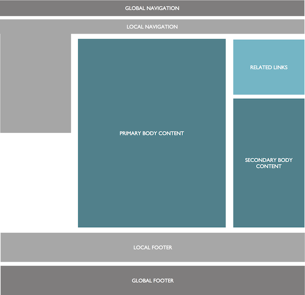
The desktop view grid structure is designed to create a horizontal layout using a 12 column grid.

For mobile users the columns are stacked vertically in order, reading left to right, so more prominent content appears at the top of the page. A navigation menu is placed off screen.

Interaction
Changing the width of the browser should change the width of the columns. If the width of the browser is less than 767 pixels then the mobile view should be displayed instead and all columns will be displayed in a single column vertical structure.
CSS and media queries
A media query is set for min-width 1200px which sets a fixed width to the site to prevent text columns becoming too wide and therefore illegible.
For any screen resolution smaller than 1199px the content is set to stretch to fill the width of the screen to maximise width available.
At less than 767px media queries are used to remove the float off grid columns and set the percentage width of every column class selector to 100% so they stack vertically.
Use of Javascript
The Modernizr library has been included to allow feature detection for media query support.
Browsers that do not support Media queries are given a fixed width by setting a class of 'campl-fixed-container' on elements declared with 'campl-wrap'.
Javascript is used to create the effect of equal height columns in the main content areas, by measuring the deepest column and setting a height as an inline style. This function is repeated when the browser triggers a resize event so the height of the columns will change depending on the width of the page. Because the equal height columns functionality is unnecessary for mobile resolutions Modernizr is used to detect page width via media query and remove the inline height attribute being set. Users without Javascript will see the columns as the original height.
For ease of development we have defined two browsing modes: desktop and mobile. We have defined Mobile as anything less than than 767px. Effectively anything smaller than ipad portrait is considered a mobile device. Modernizr's media query detection is also used to set a namespaced variable that allows several Javascript functions to detect whether the site is currently being browsed on a mobile resolution.
Component variants
N/a